

If you’re familiar with data analysis, then you’ve almost certainly come across data visualisation. It plays a crucial role in data analysis. Let’s first clarify what data visualisation is and why it’s crucial for organisations and working professionals before delving deeper into the many categories of visualisation and types of visualisation charts in today’s post.
What is Data Visualisation?
Data visualisation is the graphical depiction of information and data. Data visualisation tools, which include visual components such as charts, graphs, and maps, make it easy to view and comprehend trends, outliers, and patterns in data. Additionally, it offers a great tool for staff members or business owners to clearly deliver data to non-technical audiences.
In the realm of big data, data visualisation tools and technologies are critical for analysing enormous volumes of data and making data-driven decisions.
Why is Data Visualisation Important?
Data visualisation is significant because it makes data easier to see, interact with, and comprehend. Anybody, regardless of their degree of experience, can be brought to the same page with the correct visualisation, no matter how basic or complex the subject
It’s challenging to imagine a professional industry that will not gain from data visualisation. Understanding data is beneficial for all STEM areas, as well as for those in the public sector, business, marketing, history, consumer goods, services, retail, and so on.
Data visualisation capabilities are also in high demand among recruiters and businesses in today’s data-driven society. Professionals who can utilise data to make decisions and use visualisations to tell stories about how data influences the who, what, when, where, and how are becoming more and more valued.
Data visualisation stands squarely in the midst of analysis and visual storytelling, and while conventional education often draws a clear distinction between creative storytelling and technical analysis, the current professional world also encourages people who can cross between the two.
The Uses of Data Visualisation

Data visualisation has many applications, and each style of data visualisation has unique uses. Here are some of the most typical uses for data visualisation; we’ll discuss the many sorts of data visualisations and visualisation charts later.
Monitor changes over time
Although this is likely the simplest and most typical application of data visualisation, that doesn’t mean it isn’t useful. The fact that most data contains a time component makes it the most common. As a result, the initial stage in data analysis is to examine historical data trends.
Determining frequency
Because it also applies to data that incorporates time, frequency is likewise a rather fundamental use of data visualisation. If there is a consideration of time, it makes sense to establish how frequently the pertinent events occur across time.
Determining relationships & correlations
Data visualisation is incredibly useful for finding correlations. Despite the fact that it is crucial to be aware of correlations in data, it is quite challenging to ascertain the relationship between two variables without a visualisation.
Examining a network
Market research is an example of using data visualisation to examine a network. Marketing specialists analyse the entire market to discover audience clusters, bridges between the clusters, influencers within clusters, and outliers in order to determine which audiences to target with their message.
Scheduling
Things can get complicated when creating a schedule or timeframe for a challenging project. This problem is resolved by a Gantt chart, which shows each task within the project in detail along with its duration.
Analysing value and risk
It is nearly impossible to see precisely with a simple spreadsheet when determining complicated measures like value and risk because there are so many distinct variables that must be taken into account. However, data visualisation can be as easy as colour-coding a formula to illustrate which parts are profitable and which are unsafe.
5 Types of Data Visualisation
1) Temporal
If a data visualisation meets the requirements of being linear and one-dimensional, it falls within the temporal category. Lines with a start and end time are typically used in temporal visualisations, whether they stand alone or overlap.
Examples of temporal data visualisation:
- Line graphs
- Polar area diagrams
- Scatter plots
- Time series sequences
- Timelines
2) Hierarchical
Data visualisations that arrange smaller groupings within bigger groups fall under the hierarchical category. The ideal way to display groups of data is through a hierarchical visualisation, especially if the data originates from a single point.
The drawback of these graphs is that they are often more intricate and challenging to understand, which is why the tree diagram is most frequently utilised. Because it follows a linear path, it is the easiest to follow.
Examples of hierarchical data visualisations:
- Ring charts
- Sunburst diagrams
- Tree diagrams
3) Network
Network visualisations display the relationships between the data points inside a network. In other words, showing connections across datasets without using lengthy justifications.
Examples of network data visualisations:
- Matrix charts
- Node-link diagrams
- Word clouds
- Alluvial diagrams
4) Multidimensional
Multidimensional data visualisations, as the name suggests, have several dimensions. This implies that at least two variables are required to provide a 3D data visualisation. These kinds of visualisations can have the most colourful or striking graphics because of the numerous concurrent layers and datasets. Another benefit? These visualisations can condense a large amount of information into the main points.
Examples of multidimensional data visualisations:
- Scatter plots
- Pie charts
- Venn diagrams
- Stacked bar graphs
- Histograms
5) Geospatial
Geospatial or spatial data visualisations link to actual geographic locations by layering well-known maps with various data points. Most recognisable for their use in political campaigns or to show market penetration in multinational organisations, these types of data visualisations are frequently used to show sales or acquisitions over time.
Examples of geospatial data visualisations:
- Flow map
- Density map
- Cartogram
- Heat map
6 Types of Common Data Visualisation Charts
Probably the first thing that comes to mind when you think of data visualisation is a straightforward bar graph or pie chart. Although they may be a crucial component of data visualisation and a standard starting point for many data graphics, the proper visualisation needs to be combined with the right set of data. Simple graphs are just the beginning. There are many different visualisation techniques available to present data in intriguing and useful ways.
1) Bar Chart
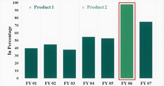
You’ve probably seen, used, or constructed a bar chart at some point in the past. Because you can quickly read bar charts for information, they are one of the most common graph visualisations.
A bar graph shows how things have changed over time. A bar chart can also make it simpler to compare the data for each variable at each point in time if there are multiple variables. An example of this would be to compare the company’s revenue from this year to last year using a bar chart.
When to use a bar chart visualisation?
Use a bar chart for the following reasons:
- You want to compare two or more values in the same category
- You want to compare parts of a whole
- You don’t have too many groups (less than 10 works best)
- You want to understand how multiple similar data sets relate to each other
Best practices for a bar chart visualisation
- Use consistent colours and labelling throughout so that you can identify relationships more easily
- Simplify the length of the y-axis labels and don’t forget to start from 0 so you can keep your data in order
2) Line Chart

Like bar charts, line charts aid in the visualisation of data in a clear and concise manner that makes it simple to quickly scan data to identify trends.
In line charts, the outcome data is displayed in relation to a continuous variable, most frequently time or money. The right usage of colour is essential in this visualisation since using various coloured lines can make it even simpler for people to analyse data.
Typically, the x-axis represents time, and the y-axis represents the amount. Therefore, this may show a company’s annual revenue broken down by month or the number of units a factory produced every day for the previous week.
When to use a line chart visualisation?
Use a line chart for the following reasons:
- You want to understand trends, patterns, and fluctuations in your data
- You want to compare different yet related data sets with multiple series
- You want to make projections beyond your data
Best practices for a line chart visualisation
- Along with using a different colour for each category, you’re comparing, make sure you also use solid lines to keep the line chart clear and concise
- To avoid confusion, try not to compare more than four categories in one line chart
3) Scatter Plot
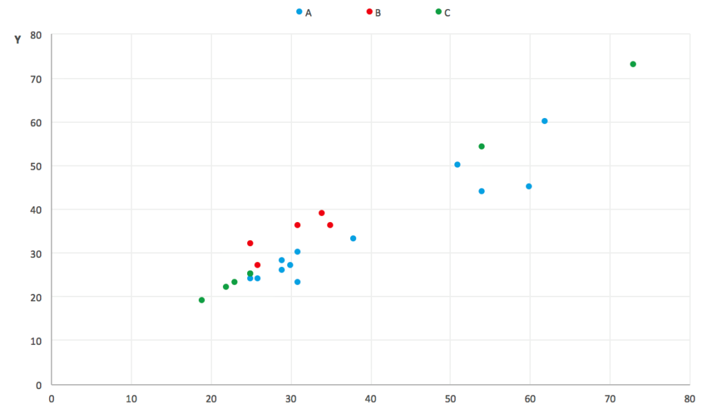
Scatterplots are the ideal visualisations to employ when there are numerous data points and you want to draw attention to patterns in the data set.
A scatter plot indicates at each point that “if x = this, then y equals this.” In this manner, a relationship between the points can be seen if they trend in a particular direction (upward to the left, downward to the right, etc.). The variables have no impact on one another at all if the plot is genuinely random and without any sort of trend.
When to use a scatter plot visualisation?
Use a scatter plot for the following reasons:
- You want to show the relationship between two variables
- Do you want a compact data visualisation
Best practices for a scatter plot visualisation
- Although trend lines are a great way to analyse the data on a scatter plot, ensure you stick to 1 or 2 trend lines to avoid confusion
- Don’t forget to start at 0 for the y-axis
4) Table

Tables are the preferred visual representation if you like to have a bit of everything in front of you when making decisions. Tables are excellent because they allow you to display both data items and images, including sparklines, icons, and bullet charts. This particular style of data visualisation also arranges your data into columns and rows, which is excellent for reporting.
When to use a table visualisation?
Use a table for the following reasons:
- You want to display two-dimensional data sets that can be organised categorically
- You can drill down to break up large data sets with a natural drill-down path
Best practices for a table visualisation
- Be mindful of the order of the data. Make sure that labels, categories and numbers come first then move on to the graphics
- Try not to have more than 10 different rows in your table to avoid clutter
5) Pie Chart
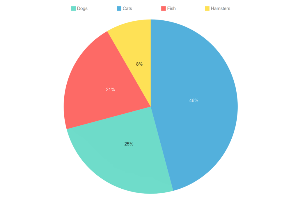
An intriguing graph visualisation are pie charts. They are simple to read and comprehend on a high level since the parts-of-a-whole relationship is made abundantly clear.
But leading data visual specialists concur that one of their drawbacks is that without putting numerical values to each slice of the pie, it is difficult to tell what percentage each area represents.
When to use a pie chart visualisation?
Use a pie chart for the following reasons:
- You want to compare relative values
- You want to compare parts of a whole
- You want to rapidly scan metrics
Best practices for a pie chart visualisation
- Make sure that the pie slices add up to 100%. To make this easier, add the numerical values and percentages to your pie chart
- Order the pieces of your pie according to size
- Use a pie chart if you have only up to 5 categories to compare. If you have too many categories, you won’t be able to differentiate between the slices
6) Histogram

A histogram is a type of data visualisation that displays how data are distributed over time or over a continuous range of values. In essence, it combines a line chart and a vertical bar chart.
The height of the bar depends on how many data points there are in each discrete interval of the continuous variable plotted on the X-axis.
Histograms also provide an estimate of the values that are concentrated, the extremes, and any gaps or out-of-the-ordinary values in your data set.
When to use a histogram visualisation?
Use a histogram for the following reasons:
- To make comparisons in data sets over an interval of time
- To show a distribution of data
Best practices for a histogram visualisation
- Avoid bars that are too wide that can hide important details or are too narrow which can cause a lot of noise
- Use equal round numbers to create bar sizes
- Use consistent colours and labelling throughout so that you can identify relationships more easily
There are a plethora of data visualisations available, and they all present distinctive yet compelling data stories. Just because your data doesn’t fit into a certain category or form of data visualisation doesn’t make it aesthetically meaningless. All you have to do is find a visual match for your date. Once you’ve taken care of that, you can begin identifying important trends and insights.
When data visualisations are assembled on a dashboard using a data visualisation platform, they work like magic to assist individuals to understand how their position or business is affected by current events.
It’s also crucial to note that data visualisations are not constrained by specific hues, iconography, or general aesthetics. Since you are the artist here, how you choose to express your narrative may differ depending on your aesthetic choices.
Build A Strong Foundation in Data Visualisation
A critical phase of data processing is effective data visualisation. Without it, crucial ideas and messages risk being overlooked. Because Aventis recognises the value of data visualisation, we’ve started our Data Analytics Professional Certificate Series with these two beginner-friendly courses.
After completing these two courses, you will be able to confidently perform the entire process of data analytics from managing your data to presenting your data.
Problem Solving with Data Analytics For Beginners
Data Visualisation & Data Storytelling For Beginners
For more information, you can get in touch with us at (65) 6720 3333 or training.aventis@gmail.com